
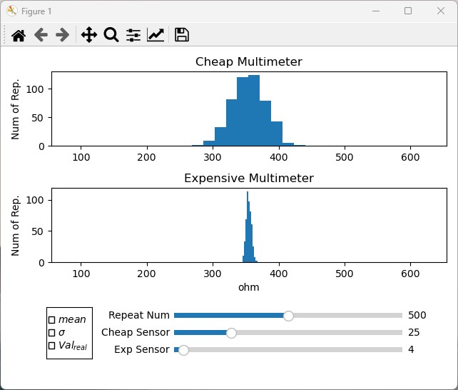
When I first started learning about probability theory, I found it to be a difficult and challenging subject. One of the concepts that I struggled with the most was measurement error and how it affects data analysis and probability calculations. Despite reading numerous textbooks and watching countless online tutorials, I still had a hard time understanding it.
That’s when I decided to take matters into my own hands and create a visual tool that would help me better understand this important concept. The tool I developed is a simple graphical interface that compares measurements taken by two different devices, each with two different error characteristics. With the help of this tool, I was finally able to see how measurement error affects data analysis and probability calculations in a way that I could easily comprehend.
As I continued to use this tool, I realized that others could also benefit from it. That’s why I decided to share it with the world here. It’s just a simple visual aid that can help anyone understand probability theory better.
My hope is that this tool can help others who are struggling with probability theory and measurement error, just like it helped me. I invite you to check out the tool on my Github page. It’s completely free and open source, and I welcome feedback and contributions from the community.
GITHUB
Leave a Reply